Interview with Stuart Aitken: graphic design
23 February 2021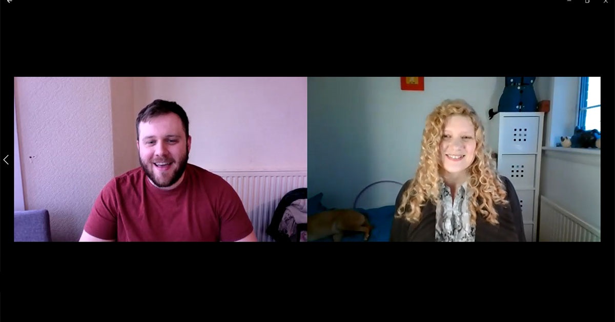
In the second of my video interviews with experts, I spoke to Stuart Aitken of Aitken Design. We spoke about everything graphic design – from how to choose the right designer, what to think about when it comes to logos, designing for print VS web to what the future of augmented reality might mean for the world of design.
This is the second in my series of interviews with experts in specific fields of marketing and fields related to marketing. If you missed it, also check out my first interview with Steve Ponton on LinkedIn.
Stuart's Links:
Transcript
Samantha: Hi, welcome to my second video, I'm doing a series of video interviews with experts that are within or related to marketing within specific areas. My last video, if you have a chance to go back and look at it, is on LinkedIn with Steve Ponton. Today I'm talking to Stuart Aitken about graphic design.
So, Stuart, do you want to introduce yourself?
Stuart: Thanks Samantha. Hello, everyone. My name is Stuart Aitken, my business is Aitken Design, and we help businesses with their graphic design, printing and website needs.
Samantha it's great to be called an expert. Thank you very much. You have made my day!
So, here's a little bit about myself. We've been doing this for five years - we reached our fifth birthday in January, and it's been a whirlwind ever since. Thank you for inviting me on Samantha.
Samantha: Brilliant, thank you! So, a lot of people don't know where to start with finding someone to help them with their graphic design. They know they need graphic design, they need a logo, brand, whatever it is they need. How do you recommend someone goes about choosing a graphic designer?
Stuart: Okay, so that's a really good question to start me off. Graphic design is such a wide field, and you have so many different niches, so many different focuses. If you ask two graphic designers what they think graphic design is, you can get two completely different answers.
It can range from branding, so your business branding, it can include websites, social media, anything really that manipulates pixels is graphic design.
The first thing to think about it what is the purpose of the project you're working on? Is it branding, is it a social media image, is it a website design? What is the item you're looking to be designed? What field is it in? If you're looking for someone, looking for someone with a focus that matches up with your project.
The second thing I would say is look at the person. So, I have always thought myself as slightly different from other graphic designers. If you stereotypically think of a graphic designer, you might think of someone who's very creative, flamboyant, artsy very. I do have those qualities, but I would say there's more of a logical part of my brain that kicks in when I'm putting designs together. I'm looking at the end user, how's the end user interacting with this project? Some graphic designers can get carried away with the project and delve too deep down into what their creating that they miss things that would meet the brief better.
So, I would look at the personality of the graphic designer and how that matches up with your project and how that is going to marry up with you. So, if you want really very artsy, very flamboyant individual, great, fantastic. Or if you want someone to just be very hands off, maybe somebody with a bit of a logical part of them.
So yeah, for quite a short question it was quite a long answer.
Samantha: So, if, for example, it's web design, you want someone who has experience doing web design specifically, not just print?
Stuart: Yes, exactly. Because they are two different things. It's two different ways of manipulating colour, two different ways of how people read that element. On a website, if the key part of your page isn't in the top third, and customers skim read it, they're going to totally miss the point.
There's also a three click rule, if the information you're trying to put forward, isn't in within three clicks of them hitting, you're homepage, you're going to lose them. Whereas on print, you've got slightly different way of kind of working with it - you've got double sided, people read from top left to bottom right, so how does that work with your design logistically?
And how is your printed item held by customers? In the last five years I’ve seem=n people moving from A5 leaflets to A6 size postcards. Because if you think about it, your mobile phone is that kind of size. People are even interacting with printed products differently. So, you've got two different avenues - so match up with the expert. That's basically my answer.
Samantha: Okay, and do you have any ideas about what if you should take into consideration if you're rebranding, or you're creating a new brand? How should you go about that when it comes to working with a graphic designer?
Stuart: Okay, so yeah, another great question. Thank you, Samantha. I feel like you're putting me through my paces today.
I think looking for a graphic designer first of all (and this is a basic) is your logo going to be a vector. That means that it's not created as a pixel-based image, it can be made as big as you want. Because of that, the trend in global companies for branding at the minute, is flat level design instead of 3D logos with shadows etc. Two-dimensional logos fits in very well to the vector way of working. If you look all the fast-food chains, the shops as you walk by you'll see that they are very two dimensional. They may be on a three-dimensional sign, but the actual brand itself is usually a two-dimensional logo.
So that's a trend that has been happening, and from there as well, you've now got responsive logos. So, with websites, you've got a responsive webpages, so if you’re looking at a webpage on a desktop, or a tablet, or a mobile, the website responds to whatever device you are using. You've got logos that do the same thing. So, take the Nike logo for example, over time, the actual brand hasn't really changed, but they've taken the name Nike out you've just got the tick, and that's the brand recognition, same as McDonald's, you'll literally just get the icon. That's a responsive logo and depending on where they're using it, some places will just have the icon rather than the logo as a whole, so it's responding to the needs of that brand within that specific project.
Samantha: So, you don't just want one logo you want to have icons that come out of it to be used in different circumstances?
Stuart: Not different icons, but one icon that is recognizable with that brand that you can use in different circumstances depending on the message and the purpose that it's being used for. For example, on a business card you don't have a lot of real estate, so you have to be very creative on where you put your brand and how you use it. You may have full billboards that use the full logo but on social media you may not have a lot of space.
Another trend that I think is really cool is augmented reality. So everyone's played, Pokemon Go where you've got the real world coming through your phone's camera, but then there is a digital world layered on top of that. That's augmented reality.
It's related to, but different from, virtual reality. Virtual reality is everything's created by the computer, augmented reality is computer elements on top of real-world images. It used a QR code, and as soon as your phone camera picks it up at displays a virtual reality aspect. So that could be a new product and a new item that you're selling. It could be a logo, it could be anything you want built into this QR code.
If you can imagine, where new technology is going, it might not be your phone in your hand, you'll probably smart glasses. You remember google glasses? I think that was built before its time. I thing smart glasses are going to come back. So, you're walking down the street, looking at the real world, and you have a virtual world layered on top of it. Imagine looking at a QR code, boom. A brand pops up in front you. Yes, it' could be really annoying. But in a weird nerdy technical kind of way, it's actually really cool. And I think that's going to be the next step in brand evolution - the way I think of it is "Back to the Future II".
Samantha: Oh yeah? With the Shark?
Stuart: Yeah, exactly. Jaws ripping him apart, okay, it won't be as bad as that, but I think that'd be quite cool, you know, can you just imagine a fast-food chain brand eating you as you walk down the street? You know, the irony. But yeah, that's the kind of evolution of I think where brands will go in the future and how they're going to be used, I haven't quite figured out exactly what that would mean, for the brand design. I don't think anyone will until it hits us.
Samantha: Yeah, it's difficult to future-proof with technology, marching on.
Stuart: It's a hunch, and know this video will be on internet everywhere, and everyone's going to hold me to it. I think brands will start to come back to three dimensions, back to the 90s idea of colour and three dimensions and getting away from that flat level design that I spoke about earlier. Vectors are constantly evolving, so I think it will still involve vectors, because that's the only way to create a that can be any size that it could be needed. But I think 3D will come back, especially if you've got it in an augmented reality world where people can interact with it. You might have a brand there, maybe be able to turn it and have something else there, something else there, something else, there's something at the top and the bottom, you know, it's then going to need to be a three-dimensional image.
Samantha: Yes, people are already doing that with products at trade shows (back when we were allowed, at trade shows - hopefully we will be again before too long). I've seen it in that environment. So yeah, I can see that that being taken a step further.
Stuart: And if you imagine it, the QR codes might be on street corners, they might be on clothing, on a name badge or whatever. Maybe when you walk by someone, they might have a QR code on them, or a coffee cup displaying the roast for that week or whatnot. I mean, that's absolutely crazy what that could then entail. So yeah, can you tell I'm a bit excited about it?
Samantha: Colour as well, that's something that you need to think about too. Within different cultures, different colours communicate different things if you're, you're looking to become international at some point,
Stuart: Oh 100%, 100%, I was trying to stay away from a colour topic.
Samantha: Sorry.
Stuart: That's fine. With screens you have three dots in every pixel - red, green, blue, and they make up every colour you see on your screen. And colours mean different things, so you got your reds, in our culture means youth, and energy you can tell I wore red today because I'm very young, but in Chinese culture, it's good luck, I think if I remember my international colours correctly. You know, it can mean completely different things. Green here is about health and nature. You can think of a colour and you go, yeah, I know what that means. But then yeah, absolutely. You go to China, you go to Mexico, you go to France, it can mean slightly different things. You do have to be very careful.
I did a series on Facebook once about design fails, and it's interesting, some of the design fails that people have come up with. Most of them are quite crude. I think it's hilarious because, one I just thought about, it was a Chinese company, and it had a tower with old Chinese style roofs and they had two circles round about it, but then it looked like something completely different, which you would not be able to put on anything at all. That's obviously a very blunt design fail, but it could be very subtle, such as the colours.
Also, colours in graphic design on your screen is are different from colours in printing. That's why I was trying avoid this subject.
Samantha: Sorry
Stuart: No, it's fine.
The spectrum of colours on your screen is huge, and as you add those colours together, you get lighter and lighter colours, and you ultimately get white. Whereas in printing your spectrum is a lot smaller. You cannot reproduce the RGB spectrum colours in printing, because we use four process printing (some use six or eight, but four process printing is the industry standard). In printing you have CMYK based colours - Cyan, Yellow, Magenta and Black (K is for Key). And as you add those colours together, you get darker and darker colours, you can't get any lighter than those base colours.
So take a neon colour, for example, it’s difficult to recreate that in printing at a value level. Yes, you can have it at a premium level. Value level, where most businesses want to be - they don't want to be spending millions on printing. It's difficult to replicate that. So, with brand colours, you don't want to start putting in all these bright colours as they are difficult to replicate in printing. It’s a mine field to navigate because you're absolutely right, you've got one culture says one thing that you want to get across, but another culture says another thing that you don't want to get across.
Yet most people go, oh, colour, I can have a red, I can have a have a Green, yeah that'll do.
Samantha: And that's another reason why you want to use an experienced graphic designer, who knows how things look on print and screen. Not just someone you found on Fiverr who can be anyone.
Stuart: Yep, you might get lucky, you might get away with it, but is that the risk that you want to take in your business for the next three or four years. I would always recommend you rebrand every three, four years. You could say I'm biased, you could say I'm trying to create work for myself, but you need to keep your brand fresh, it might not be a huge massive complete change, but just tweak it slightly. And I would, I would have a look at evolution of brands like Nickelodeon, eBay, Google, over the space of the 1990s 2000s and 2010s. Their brands evolved into being very creative, out there very, splashes of paint splashes that so that into the more I would say adult like.
Samantha: And I think it's important that is its just evolution, you don't want to lose any brand equity that you've built up by completely changing everything. And some some brands have made that error. But it' just making sure it's fresh, as you say.
Stuart: Yeah, what I would recommend if anyone is thinking of changing their brand, is get customer feedback. Just a quick survey, it doesn't need to be anything huge, just a quick “what do you think of when you think of us?”, “have you seen our logo about?”, “what do you think of it?”, just something simple. That will give a graphic designer a million things to work with. For example - the purple moon is recognizable, great, let's keep it, but the blue chicken isn't so let's get rid of that - I know that's completely random. And please nobody use purple moons and blue chickens on logos. But yeah, that's my advice – get feedback before you go anywhere near a graphic designer. And it might be that you look at your logo and you’re tired of seeing that logo, but you see it day in and day out but for everyone else, it may still be quite fresh, still quite relevant. You're absolutely right, brand loyalty, brand equity, you don't want to get rid of that overnight. Because then you're basically starting from scratch.
Samantha: Absolutely. And another thing people don't always think about, especially if they're quite small, and they're just starting out, are things like the font and being consistent and the colours. Do you think that's really important in terms of consistency, and making sure that customers subconsciously, even if it's just a letter or an invoice, they immediately know who it is before they've even read anything?
Stuart: Yeah. 100%. I mean, I could just say yes, and that would be the answer to it. In all my previous roles (not all as a graphic designer), and I have worked for big conglomerates, and charities, third sector, all of them had brand guidelines. And, and they have them for a reason. So, whether it's social media, whether it's in print, whether that's on a screen, whether that's a text message, whatever. It keeps that consistent, and that brand loyalty. It keeps them professional as well.
The amount of posts I've seen from small businesses that are trying their best, they've had the logo done but then they've put their own little bit down the bottom in a completely different font, and you can tell It looks different. Or they've screenshotted the logo from the email that they got from the graphic designer, and you can tell, and I think most people can even tell subconsciously and it sends the wrong message in my opinion. My thinking is that if a big, huge, massive conglomerate and a charity have a brand guidelines, I think even the one person, two person business still needs to have brand guidelines. How do you use our logo, where is it used on social media, where do we put it? And how do we use this file and how to use that file. When I do a logo for a client got a logo, and they say they just want to use it online, if I'm doing my job, I'm going to do it or them. It's five minutes of my time, it's not an issue. It means that they get the right look wherever they're putting it, and it helps them. I would much rather help a small business survive and journey with them through that progress, then continually find new clients. I want to help my current clients, I think that's what I'm trying to say.
So to answer your question. Yes, I think 100%, brand consistency over everything is key. And because if you start using one font on social on, say Facebook, another font on Instagram, and your printed stuff is another thing, it's not going to look good. I can tell you that working over five years, having people email me a previous stuff before, "Hey, can you update this" "hey what's this going on" I can then try to update it keeping on brand. Yeah, I'd 100% say, you know, the big companies are onto something. That's why they do it, so why don't the small companies do it?
Samantha: Yeah. Even if it's very simple brand guidelines - always use this font. These two or three colours.
Stuart: Yes. And it just makes a world of difference. Because say, you've got like a grey in your in your brand, somewhere, nice silvery grey, but you put the text at the bottom in black. It's just going to look slightly off. Whereas if you put that text in the same grey, a million times better.
Whenever I do a logo, I always attach the font files I've used. And if the client asks for I produce brand guidelines, a simple document, here's your logo, make sure you have space, you should use this file, because there's no background or transparent background, so that it fits into any project, or here's an inverse one so it can fit on darker backgrounds, all that kind of stuff. It just makes your brand look a million times better because you've paid an expert to create that stuff for you. So why not use it to the best, the best of its ability?
Samantha: And we've spoken in just a little bit about print, I think people forget about design and print to a certain extent these days. I keep hearing "print is dead", there are certain things that are not, print-wise, selling as well as they used to magazines and newspapers, etc. However it's still extremely useful, especially as people are so used to receiving emails, if they receive something in the post, it's just unusual now.
Stuart: 100%? To answer that question, I would say print is not dead. Yes, there's been a tendency in the market the last 10 years for printed material to reduce in its popularity. I've been I've been in industry for five years, and a bit before that as well, when I was training and I have noticed that over those years print has gone down. Has COVID just accelerated that? I don't think so I just think it's people just kind of waiting to see what happens. I think print is going to go back up, even networking events, come back and face to face meetings, all that kind of stuff, there will be a resurgence. And talking about getting things in the post, at Aitken Design we're starting a quarterly newspaper, not like a newspaper as in news but like stuff about us, so we have special offers, a bit about staff, and directors editorial. I get to write stuff and publish it, how amazing is that? Also, the new stuff coming out, like augmented reality what's happening in websites, all that kind of stuff. It's going out to our clients to help them see what's going to go on to make the right decisions for what they need in the future.
We're putting it on newspaper because that is different that is the new and radical way of putting things out there. Everybody does an email newsletter. I know at the beginning of my day, I look at my email, a newsletter came in overnight, and I go, It goes away, and is never actioned, unless it's got special code on it, or something. Unless I'm really interested in it, it's not staying in my inbox.
So print is not dead. And with the global pandemic, we've now got food stickers, window stickers, keep your distance stickers, hand sanitizing stations. But there's not a lot of things out there saying that the virus, any virus can't stay on published paper material for a prolonged period of time. It is safe to get your post in through the mail to pick up a leaflet to it's safe. It's safer than touching things at the supermarket.
I believe the world will get back to a sense of normality at some point, and we will be moving on with our lives, all of us in our society evolve and it won't be what it was before, but it will be a sense of normality when we get to it. I believe print will have a, part to play in that in that society. People are also buying business cards. Every single new client that's came on board with us gets a little pack with a business card in it with a leaflet with a flyer, it's got a bit of information about us and how we can help them the future.
Samantha: I know it's old fashioned, I put everyone in a CRM, but I've still got all the business cards. I find if I had something physical, it's something more tangible than say, a LinkedIn connection. You want to do both, but I remember people better based on their business card, I know where I met them. I know what we spoke about. Because you've had that tangible thing that helps your memory
Stuart: 100% I think there's a place in the world for a blend of the two. Yes, there’s a digital world and we can't ignore that. Yes, our print world, we can't ignore that. And that's what we say from day one. That's why we help design websites, as well as design for print. We believe in the blended approach of the two. Print is not dead and websites don't rule the world, there is a place for both.
And you're absolutely right, you've got that tangible thing. And it's been done like that for a long time for a reason. Because you get that tangible business card in your in your hand. You've got your book of cards naturally, I have a very similar and folder of business cards and so, I like your folder Samantha, and I think that helps you connect with people online, doing it in your email marketing, getting suppliers, getting clients, all of that helps. It's just another tool in the toolbox. It is not the complete toolbox. And so yeah, I we believe in a blend of the two and it works.
I am part of a networking group, and every time this individual is there, the first part of their pitch is who needs business cards, they're dead. And they throw a bundle of business cards over their shoulder. That's their pitch. I don't believe that at all. They're selling a CRM system, an online system that helps people digitally connect. And as I said, I think the blend, I think the blend is the best using the two of them together for the best of your busines.
And yeah, that was a long-winded way of saying yes, print's not dead and using it together as part of a wider strategy is the best way of thinking about it. And being that radical way of doing it, works.
Samantha: We still get the junk mail that's not addressed to anyone in particular through our letterboxes. But it's nice to get something that's not like a bank statement or bill addressed to you - it’s somehow more exciting these days. Whereas how many emails do you get a day?
Stuart: Yeah. That's actually quite exciting. You are spending time, value time, but think of your hourly rate. Right? And you spend 10 minutes writing a card. How valued is that? If you do a mass email out to thousands of people, it may take you 10 minutes, but it's less time it's less value per person. And people consciously or subconsciously realize that, people know that. We hand wrote all of our Christmas cards to our clients last year. And, and we did that purposefully. Whether you're selling to the public, or selling to other businesses, whatever service you're providing, whatever product - that speaks volumes.
Samantha: Especially if you put a relevant message in there handwritten that's specific to the client, and it makes them feel cared for.
Stuart: Yep. And that, and that is only achievable through print. And because you're creating that product, that people can put their own message on that then they can, then put to their perfect client. So, to answer your question print is not dead, and that's the reason why.
Samantha: Okay, and then any other things that you feel people should think about in terms of graphic design?
Stuart: I think it's just to keep it simple. The big thing to keep in mind, is who is your end user, who's your client that's looking at this, that's dealing with this, that's handling this, that's, whatever the project is, who is your end user? If you have got a message that suits them, perfect, grand, you’re onto a winner, and keep it simple.
That's my two things for graphic design. It's also the two basic rules of marketing really, keep it simple, and keep it clean, and keep your end user in focus. We've all been there, we've all tried to get our message out there. We've either put in a message that’s too complicated, or got the wrong client in mind and we've gone, "it's failed, our business is useless". It's not it's just shifting slightly. As soon as you hit that perfect client, as I call them, you're onto a winner.
I remember, a year into business, that this is the big question that all businesses in our sector kina deal with is; how do you, how do you advertise a marketing business? I'm in marketing, advertising, I create things that help people sell things, basically. How do you advertise us, so I'm trying to think it all through, and obviously, we're B2B or business to business. So I created this special offer for businesses, and it was the most complicated special offer I think any business has ever thought of. It was like, it had to be a Monday between this time and this time, it's like 25% off, but it's a seven-day turnaround time, and it's a special offer but it's only on a certain product, at certain times. No one ever took me up on that in the six months we were running it. And that stopped quite abruptly. And nobody even knew because it's too complex. And it had the wrong message to the wrong person.
Samantha: Hence my tagline "making your complex simple". It's so important in in marketing communications, especially with the industries I work with that are a bit more technical, if you want to get as simple a message as possible to grab customers’ attention.
Stuart: Yes. And then you start feeling those slightly more complicated things you're adding to the foundation you've built. Yeah, the way I kind of think of it is like a pyramid, you don't start at the top, you know, build the top, then the bottom and go up to, no. It's that foundation you build your way up with that. Yeah. And then you have a solid base for every client.
Samantha: Absolutely. Brilliant. Well, thank you so much for that.
Stuart: No problem at all.
Samantha: I'm sure a lot of a lot of people find this video very interesting. there's a lot of great nuggets in there.
Stuart: Thank you very much, I always try. A couple of years ago, we had a lot of Facebook videos with design tips and all that kind of stuff, people find it interesting. If anyone's got any questions, or agree or even disagree, we can have a reasonable adult conversation over it. I'm interested in social media, but I quite like to discuss things with people, individuals, that even have a different opinion because everybody's different. Everybody's got different thought and things. These are just my thoughts. It's just my experiences I've had and whether I'm in the minority or the majority.
Samantha: I shall be putting Stuart's details wherever I share this on social media and on my website where I'll be hosting it, but is there anything particularly you want to plug Stuart?
Stuart: No, I just think I just maybe want to plug the sector in general. There's other places online that do a very similar thing, but try and devalue people's skill set. And, and these are people's livelihoods that are at risk. And there's a big thing at the minute about “support local” due to everything that's going on. I want to put a big shout out there to say, please support local, not just in my sector, but in other sectors as well. And please support people because, yes, you know, every employer has been affected, people that run their own business have been more affected than others. Some businesses have had to be under to keep themselves afloat it's unreal. So yeah, it may cost you 20 quid more, 30 quid more but please don't go into places like Fiverr, please support local.
Samantha: And, and it will, it might be 30 quid more now, but it will save you hundreds of pounds in the long run. I think.
Stuart: 100% 100% the amount of clients have come to me and they went here's the logo I've used for six months, got it off Fiverr Yeah.
Samantha: So yeah, yes, people please, and I say this about everything. Please get professionals involved as if you've got the budget. Do it because it's worth it.
Stuart: 100%
Samantha: Brilliant. Thank you very much Stuart. And thank you everyone for viewing.
Stuart: Thank you.
If you need any help with your marketing strategy, call me on 07791 521439 or email me at samantha@labrakita.co.uk
If you need help with your graphic design, contact Stuart on 07843 987446 or stuart@aitkendesign.co.uk